M365 Web Checkout Redesign
Microsoft

Background
OVERVIEW
Over the years, Microsoft 365’s checkout flow has evolved to support an expanding suite of products and plans. With the introduction of Copilot AI, there was a new need to integrate add-ons into an already complex purchasing experience. This moment presented an opportunity to rethink the checkout experience, making it more scalable, user-friendly, and aligned with the future of Microsoft’s offerings.
I was tasked with reimagining the checkout experience to support Copilot add-ons within a simplified multi-line flow. I explored 3 different design directions aimed at improving usability, increasing clarity, and streamlining the decision-making process. My goal was to surface key improvements while shaping a long-term vision for a more intuitive and flexible purchasing experience within the Microsoft 365 ecosystem.
MY ROLE
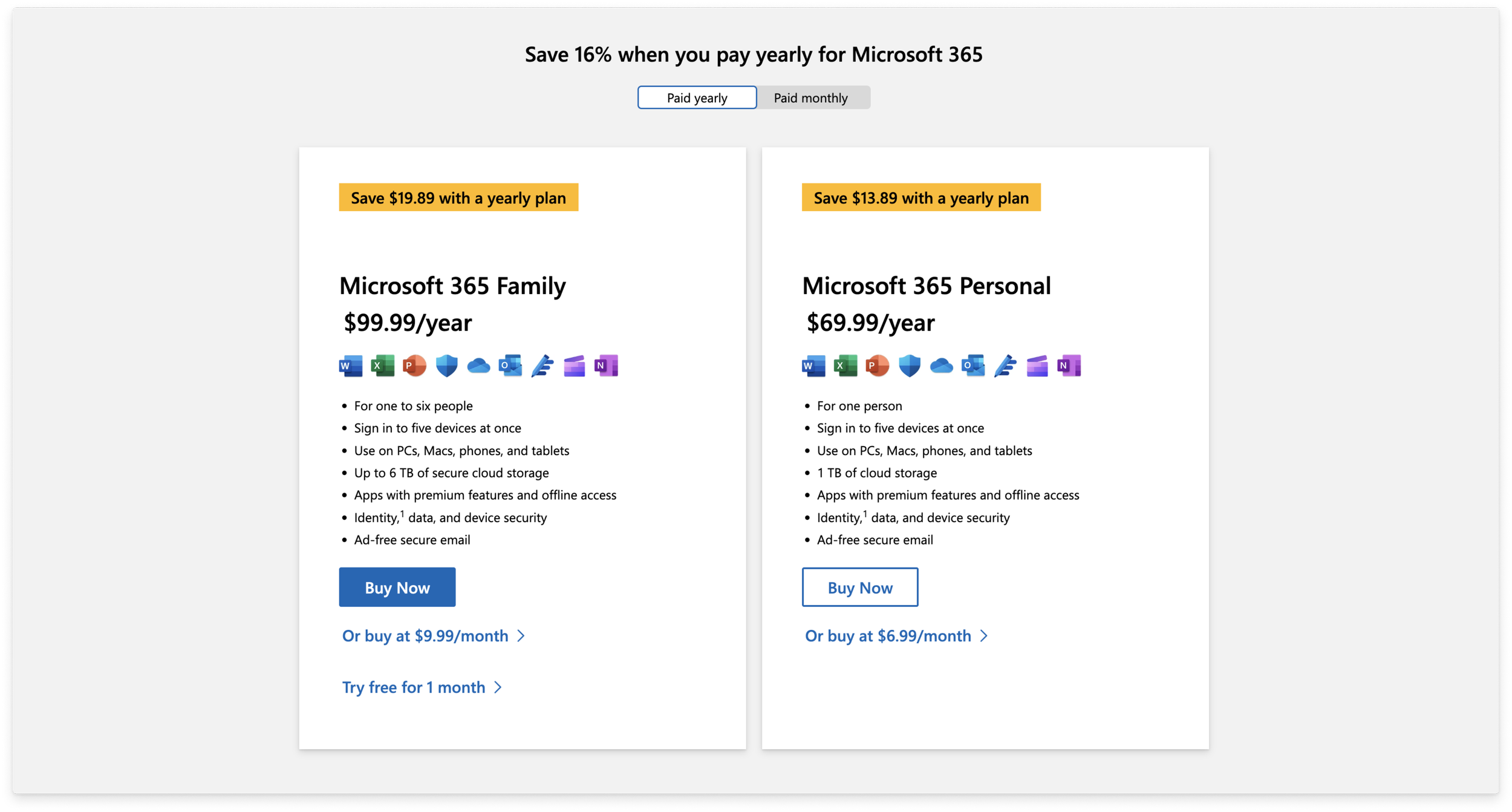
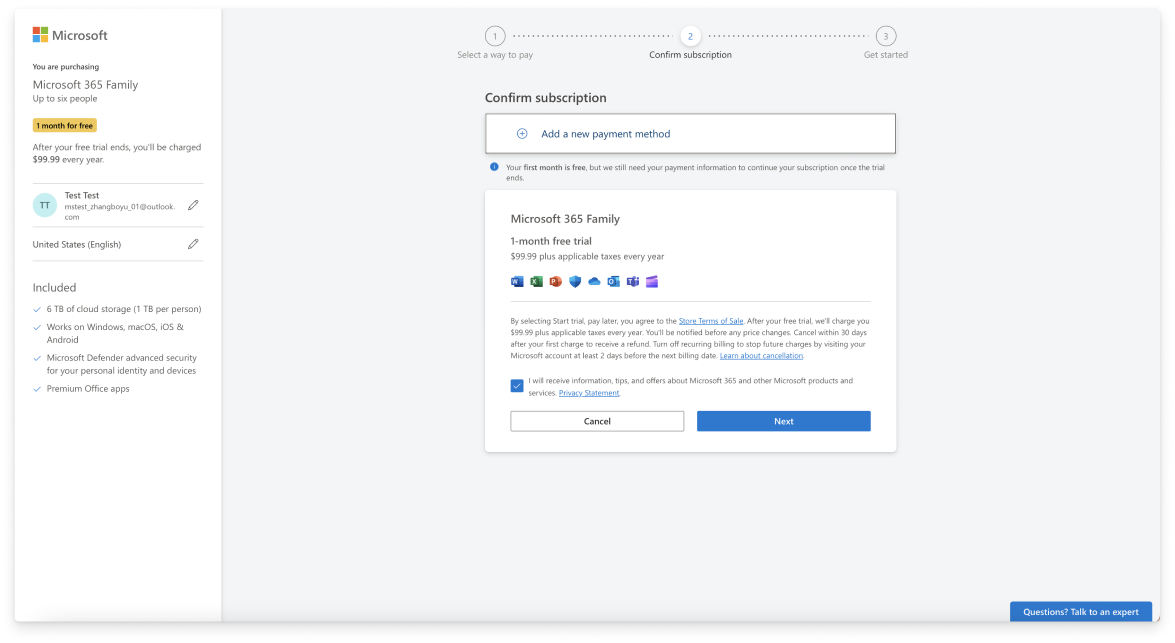
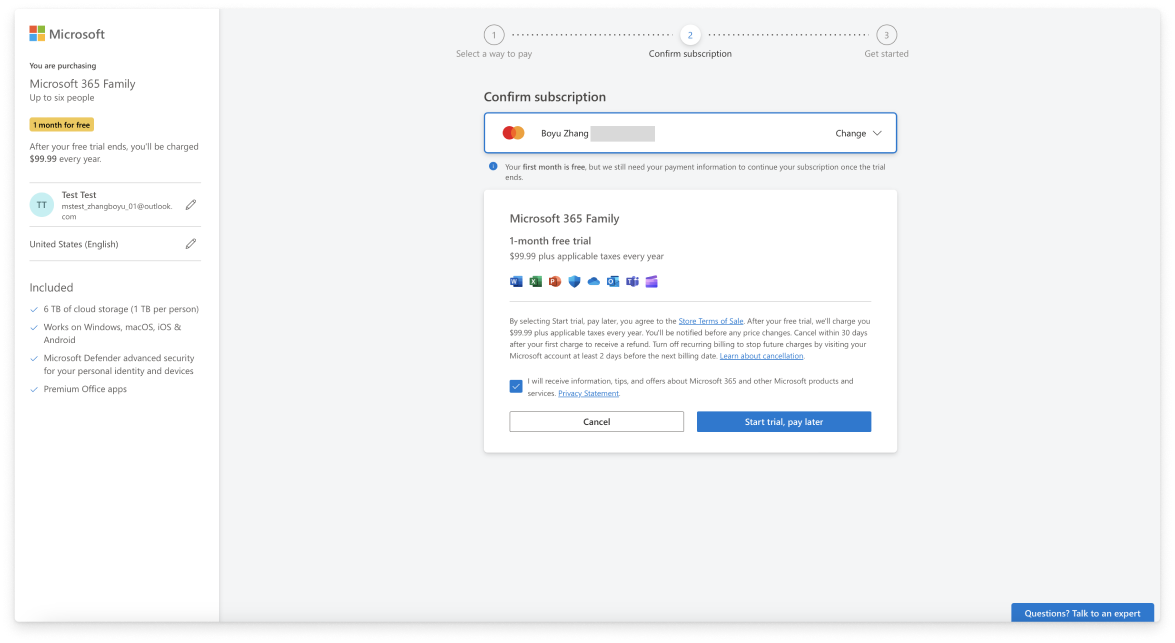
Current Microsoft 365 Checkout Flow
In the current journey, users enter the checkout flow by clicking “Buy Microsoft 365 Family Now” from the marketing page. The checkout screen they see contains a side pane with plan name, value props, and account information. The main canvas is where users take actions to add payment and go through their checkout process.
Based on user feedback, the current design doesn’t reflect Microsoft’s modern brand, users feel disconnected which results in high drop-off rate.
Competitor Analysis
To ground my checkout redesign in best practices, I analyzed checkout flows from Adobe, Zoom, NordVPN, and other leading platforms. I mapped out common patterns, key differences, and the trade-offs each approach made to offer add-ons. This comparison surfaced both pros and cons across industries and helped identify opportunities to simplify the flow, minimize drop-off points, and inform the design directions I pursued.
I designed and presented three new checkout flow options, ranging in complexity to explore different levels of user guidance and flexibility.
Redesign 1: Multi Step Flow
After auditing the existing checkout flow and reviewing common patterns, I identified the multi-step layout as a widely used and effective approach. Breaking the process into individual steps makes the experience more digestible and reduces cognitive load.
This concept utilize the open canvas to highlight different plans, while a fixed order summary pane remains visible on the right. A step indicator at the top helps users track their progress. Interactive elements like “Learn more” buttons or app icons trigger modals and cards that provide contextual education without pulling users out of the flow.


Redesign 2: Single Page Progressive Disclosure
Unlike the multi-step approach, the single-page checkout presents all necessary information on one scrollable page. Users move through the flow vertically, completing one section at a time.
As each active card is completed, it collapses into a summary view, helps reduce the clutter and keeps the experience focused. By minimizing visual distractions and consolidating information, this design aims to improve clarity, reduce cognitive load, and give users a greater sense of control throughout the checkout process.
Users progress through the cards on the left. The “Process Payment” button on the bottom right remains disabled until all required information is entered. Once the user proceeds to the next step, the previous card collapses.


Redesign 3: Single Step Checkout
This is the simplest flow I explored. It condenses the experience into one focused layout, placing the order summary and add-ons in the fixed left pane, while the right pane collects payment information. Once the user completes their payment details, the checkout process is finished.

Conclusion
This was exploratory work that informed later experiments conducted beyond my handoff. Through these three explorations, I evaluated how varying levels of complexity impact user clarity, decision-making, and checkout efficiency. Each concept addressed different user needs, from simplicity and speed to flexibility and discovery. These directions not only laid the groundwork for integrating add-ons, but also shaped a long-term vision for a more scalable, user-friendly Microsoft 365 checkout.